The most complicated is that the structure, the pattern, the colors of the money fit to the structure of the photo, if not the entire palimpsest looks confused.
But of course, to make a palimpsest isn't an exact science with norms. You can calculate many things ahead, but how the end product really will be, is often in the stars. It's really learning by doing and learning from errors. But this is art!
I made some palimpsests with bank notes. The majority of them are really good, but two of them weren't good.
Therefore I've decided to scrape off the ink, so that I can use them once more. Yes, the definition of a palimpsest is exactly this what I did now. But it didn't work. Then I thought that I can use the other side of the bank notes, the side, which stuck to the paper, which I've used for the bank note collage. And this plan worked good.
Of course, rests of the paper remain on the bank notes, but I like this.
Now I've made three new bank note collages. Two in the size 20x30cm and the other one in the size 14x17,5cm.


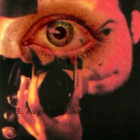
I already had an idea which photo I'll use for the small one. This:
 |
| "eos vs. eos", brasil, 2009 |
 |
| "A021 do brasil", brasil, 2013 |
No comments:
Post a Comment